Cinder
A loud, charred wordmark and a heat-mapped colour system for a roaster that takes the dark seriously.
Client
Cinder Coffee Roasters
Sector
Food & Bev
Year
2025
Role
Brand identity · Packaging · Art direction
The challenge
Cinder roasts dark and unapologetic, but their bags looked like every third-wave roaster — kraft paper, thin sans, a little drawing of a mountain. They wanted to own “dark roast” without becoming a cliché of it.
The concept
We leaned all the way in: a heavy, slightly scorched display wordmark, a colour system mapped to roast level (from ember to char), and a grid that runs hot. The mark looks branded — literally, like it was burned on.
The system
Logo, type & colour.
Wordmarkcinder
MonogramC
Type
Aa
Colour
Char#1A1714Base
Ember#E2503AAccent
Ash#8A7F73Neutral
Cream#EFE7D6Paper
In the wild
The system, applied.
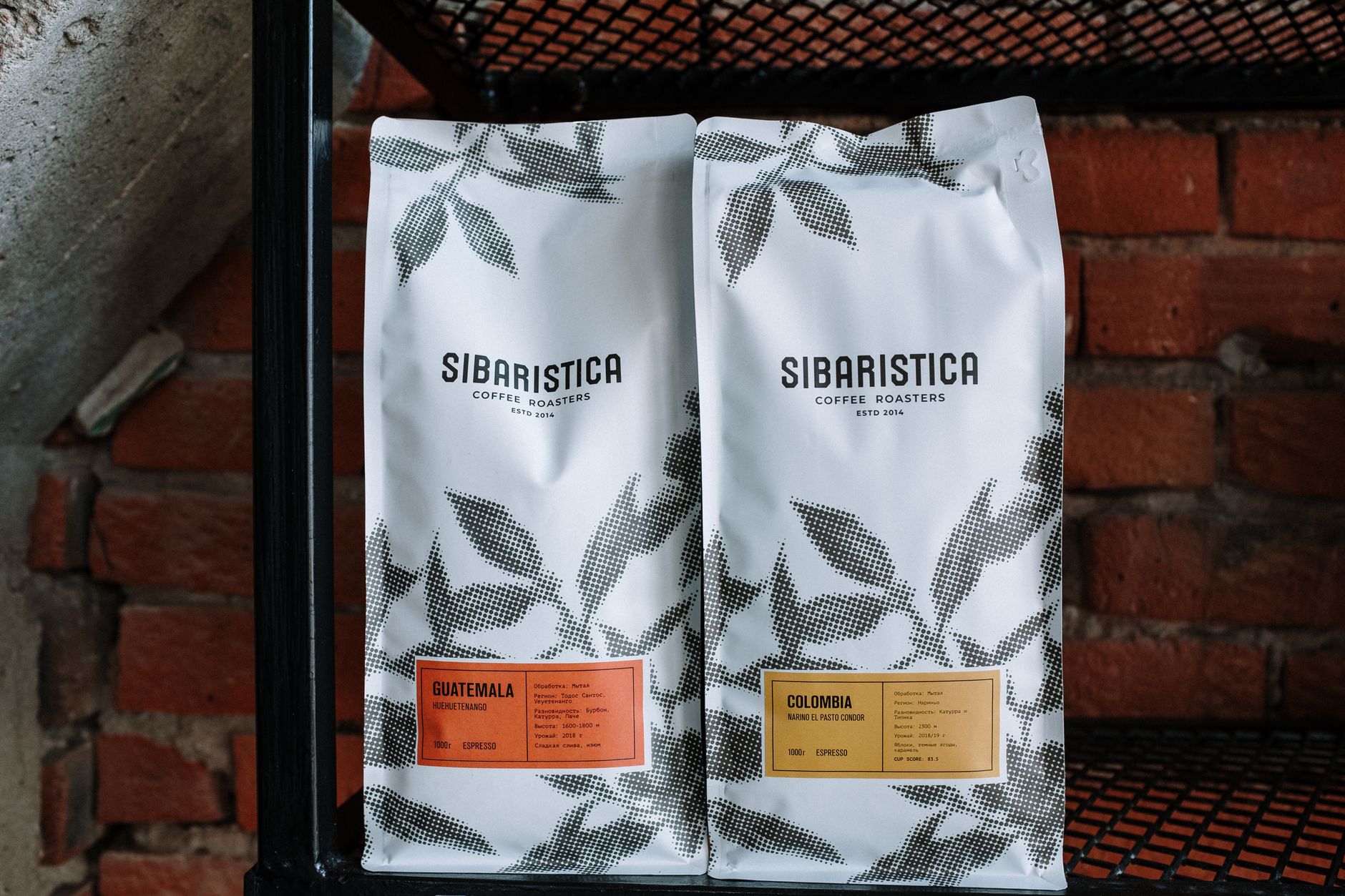
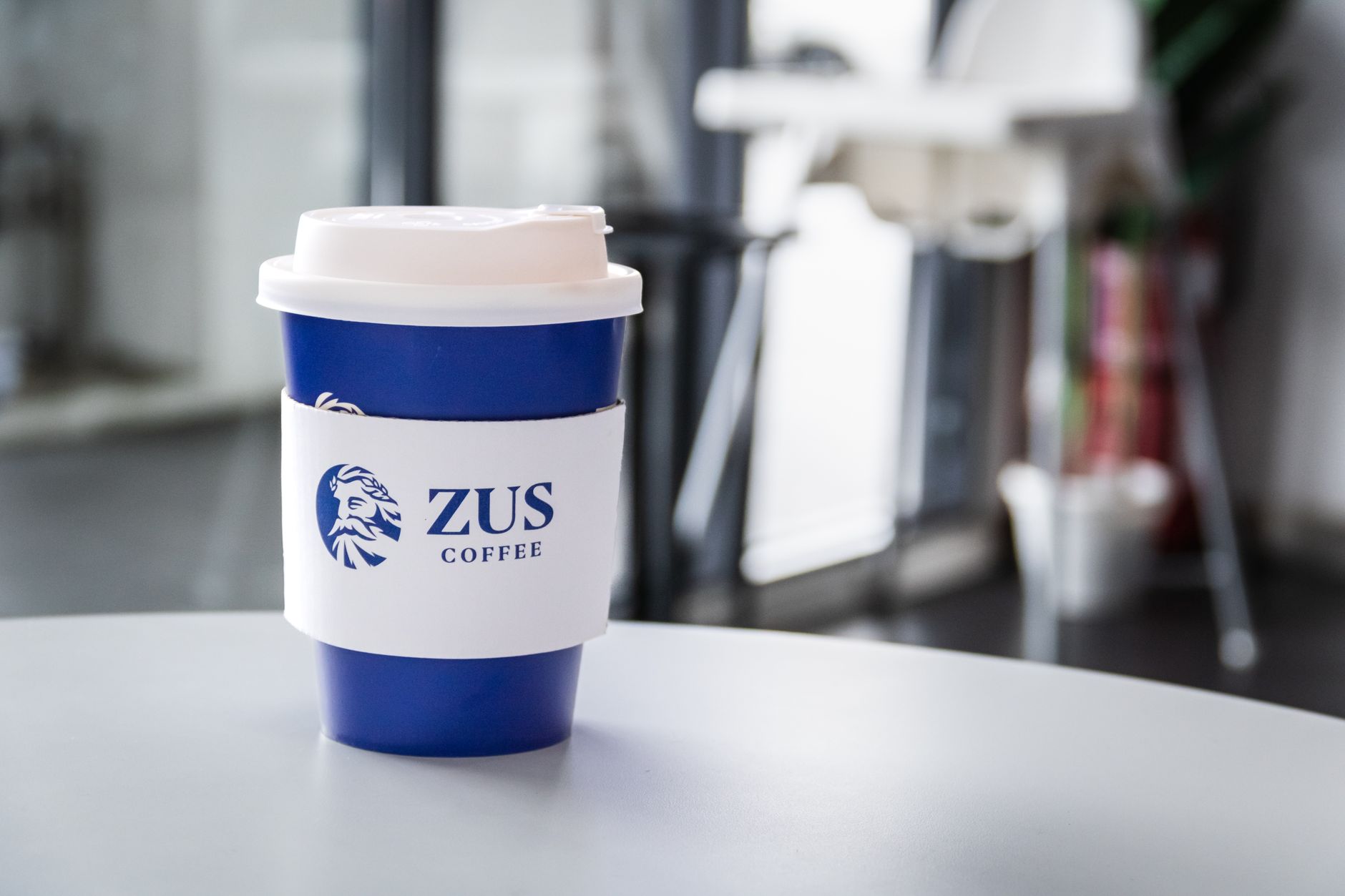
Bag system (5 roasts)Roast-meter colour scaleCafé signageCup & sleeveWholesale deck
The outcome
Cinder’s rebrand turned the bag into the marketing. Wholesale accounts doubled, and the “roast meter” colour system became the thing customers point to on the shelf.
×2
Wholesale accounts
+27%
Bag sell-through
5
SKUs unified
“The bag became our best salesperson. Wholesale doubled and we didn’t change the coffee — we changed how it looks on a shelf.”— Theo Marsh, Co-founder · Cinder Coffee