Meridian
A precise, confident system for a fund that wanted gravitas without the beige.
Client
Meridian Capital Partners
Sector
Finance / B2B
Year
2025
Role
Brand identity · Type · Web
The challenge
Meridian is a sharp, modern fund stuck behind a 2009 logo — serif initials, navy, a tagline nobody read. They needed to look as rigorous as their thesis and as current as their founders, without drifting into fintech-startup cliché.
The concept
A single confident line — the meridian — runs through the whole system. The wordmark is set in a custom-tightened grotesk; the palette is near-black with one electric signal colour; everything aligns to a strict baseline grid. Restraint reads as authority.
The system
Logo, type & colour.
Wordmarkmeridian
MonogramM
Type
Aa
Colour
Ink#0C0E12Base
Graphite#2A2E36Surface
Signal#C9F24AAccent
Bone#F2F1ECPaper
In the wild
The system, applied.
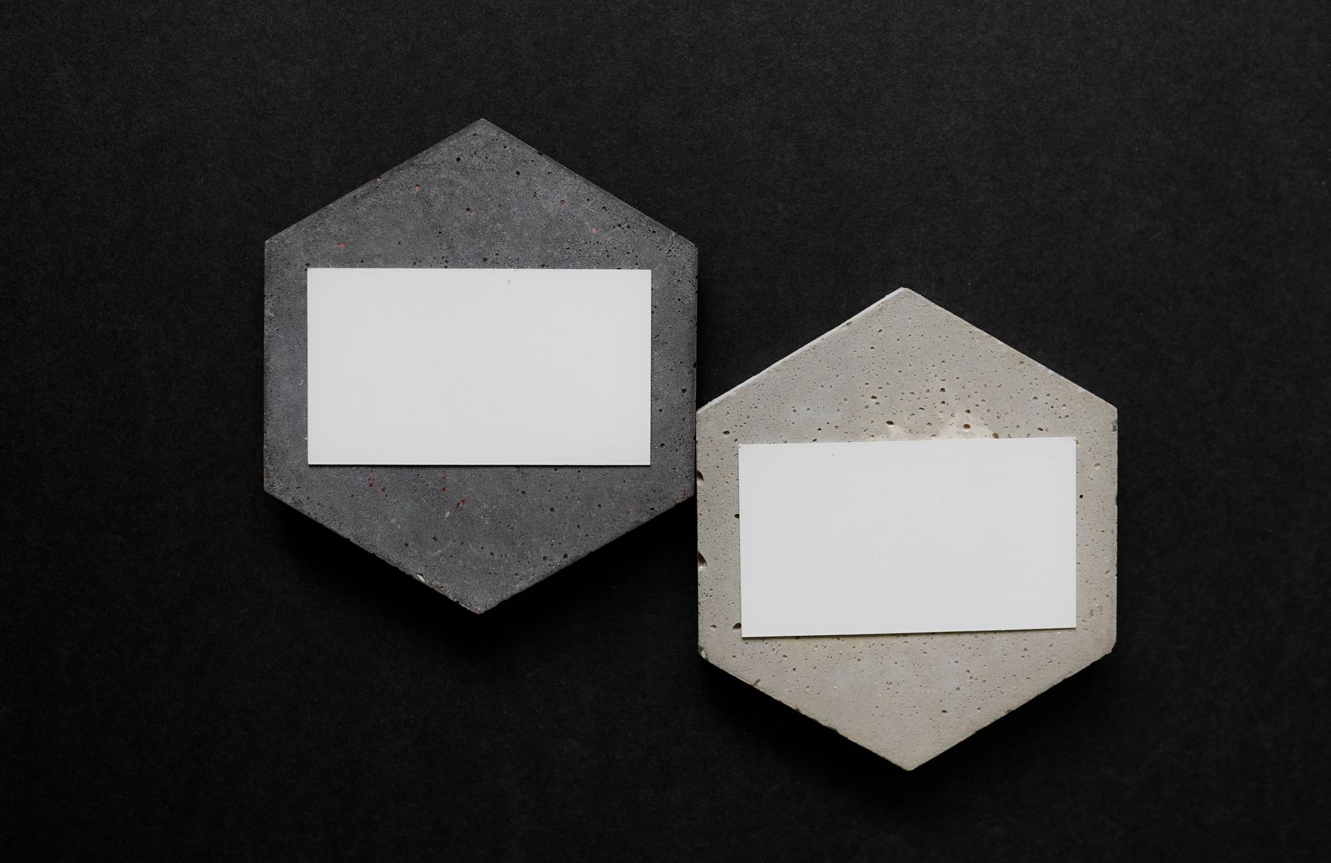
Pitch & LP deckWebsiteStationery systemData viz languagePortfolio sub-brands
The outcome
Meridian launched a new site and pitch system that LPs described as “finally matching the work.” The identity now anchors a portfolio of 14 holding-company brands.
14
Sub-brands aligned
100%
On one grid
3 wk
Faster decks
“Our LPs told us the brand finally matches the work. That sentence alone paid for the project. Calm, sharp, exactly on brief.”— Daniela Reyes, Managing Partner · Meridian Capital