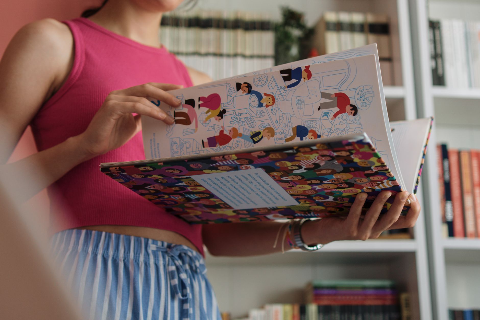
Fable
A warm, hand-drawn identity and editorial system for an indie children’s publisher.
Client
Fable Children’s Books
Sector
Publishing
Year
2024
Role
Brand identity · Editorial · Illustration direction
The challenge
Fable’s books were beautiful; their brand was an afterthought stitched together title by title. They needed a publisher identity that felt like a world, not a logo, and a flexible editorial system that let every book stay distinct.
The concept
We drew a friendly, slightly imperfect wordmark and a small cast of marks that recur across the spine, the endpapers, and the imprint. A warm two-colour system and a generous editorial grid give every title room while keeping the family obvious.
The system
Logo, type & colour.
Wordmarkfable
MonogramF
Type
Aa
Colour
Ink Blue#21324BBase
Marigold#E9A53FAccent
Rose#D98B86Secondary
Paper#F6EFE2Paper
In the wild
The system, applied.
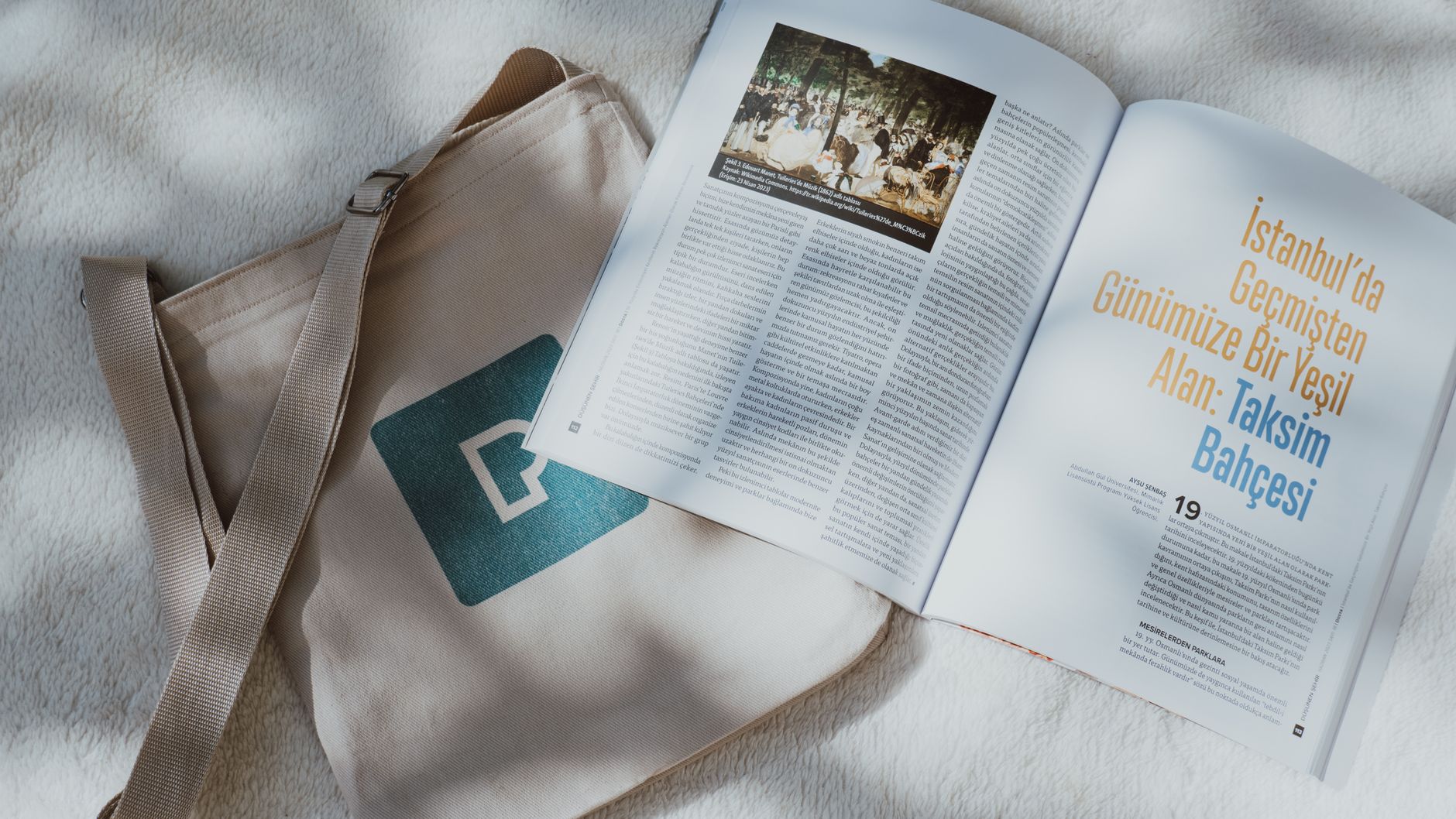

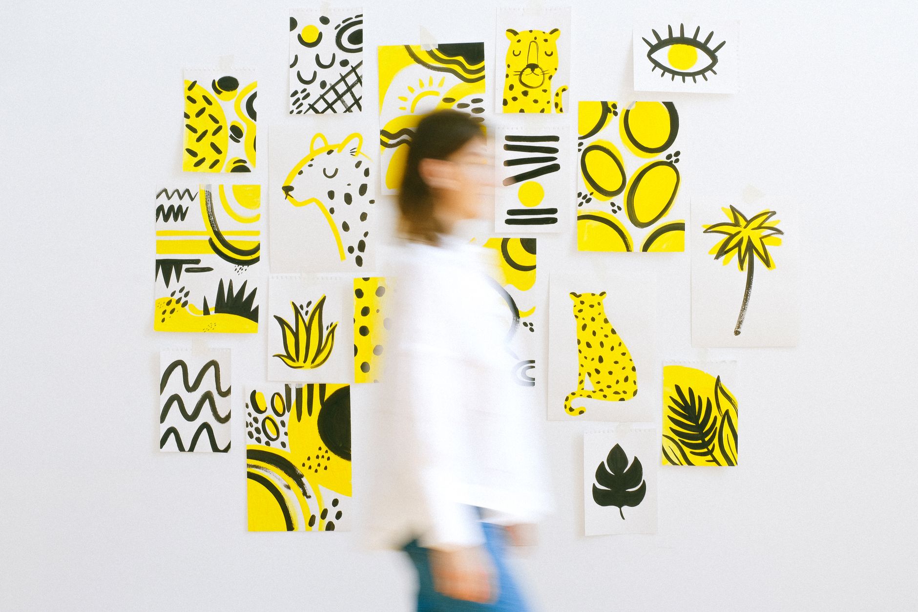
Imprint mark & spine systemEndpaper patternsEditorial gridCatalogueBookmark & merch
The outcome
Fable’s spines now read as a collection on the shelf. The imprint mark became a small collectible in itself, and the system carried a 40-title back-catalogue refresh.
40
Titles refreshed
+22%
Series sell-through
1
Collectible mark
“Every book felt like its own thing and a Fable book at the same time. That’s the trick we couldn’t crack for years.”— Sam Whitlock, Publisher · Fable Books