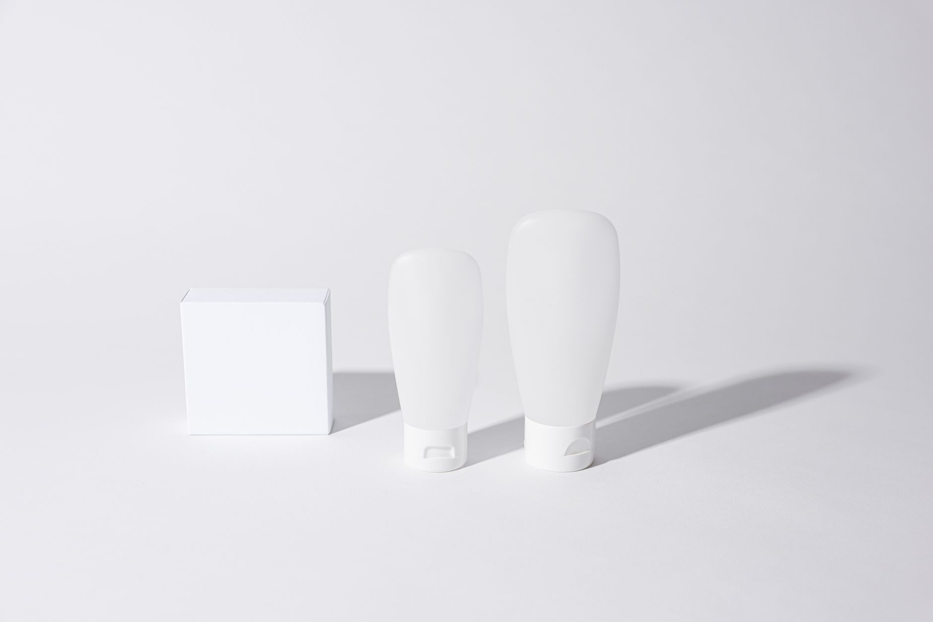
Halcyon
A calm, clinical-warm identity for a sleep brand that wanted to feel like rest, not a pharmacy.
Halcyon had a great product and a forgettable look — a soft-tech logo and stock-blue gradients indistinguishable from every other sleep startup. They needed an identity that felt like a deep breath and held up on a pharmacy shelf next to legacy brands.
We built the brand around the “quiet hour” — that single calm before sleep. A low, wide wordmark drawn with soft ink-traps, a crescent monogram, and a palette pulled from a dimmed room. Type does the work; ornament stays out of it.
Logo, type & colour.
The system, applied.
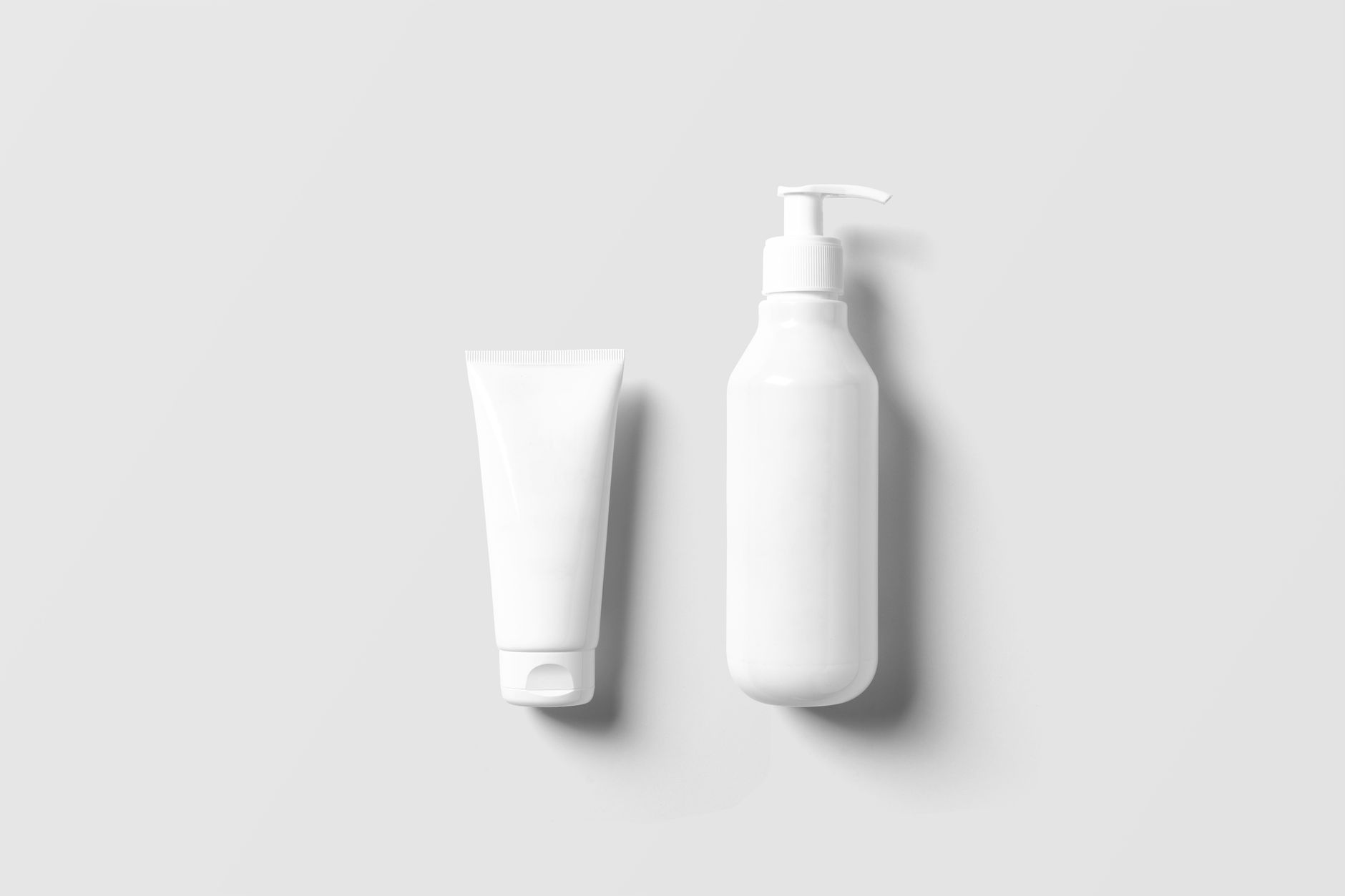
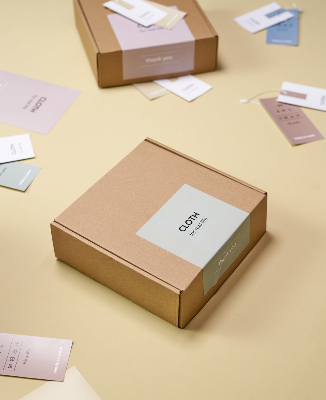
Halcyon relaunched across DTC and retail with a system that scaled from a 12pt dosage line to a 4-metre pharmacy endcap. Reorder rate climbed and the brand was picked up by two national chains within a quarter.
“Marlowe didn’t give us a logo, they gave us a language. We can launch a new product now and it just looks like Halcyon — no committee required.”— Priya Anand, Founder & CEO · Halcyon Sleep Co.