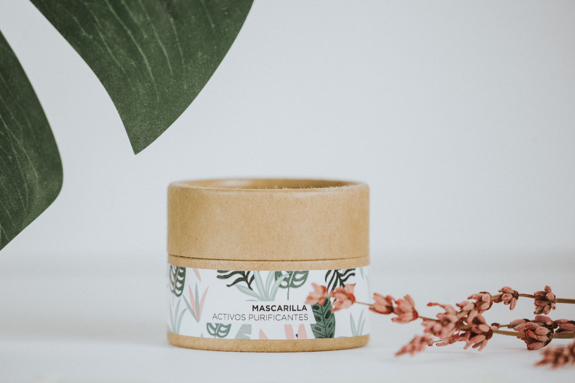
Orchard
A fresh, botanical-modern identity for a skincare line grown from real fruit acids.
Client
Orchard Skincare
Sector
Beauty / DTC
Year
2023
Role
Brand identity · Packaging · Web
The challenge
Orchard’s formulas were genuinely fruit-derived, but the category is a sea of millennial pastels and lowercase sans. They wanted to feel honest and premium — closer to a greengrocer than a lab.
The concept
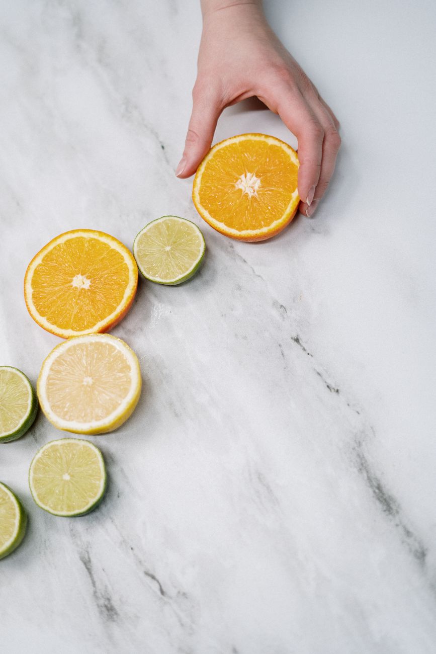
We treated the brand like produce: a crisp, slightly serifed wordmark, ingredient-led colour coding, and photography that shows the actual fruit. The system is fresh without being twee, premium without being clinical.
The system
Logo, type & colour.
Wordmarkorchard
MonogramO
Type
Aa
Colour
Bark#2B2A22Base
Leaf#5C8A4AAccent
Apricot#E8A66BSecondary
Milk#F4F1E8Paper
In the wild
The system, applied.
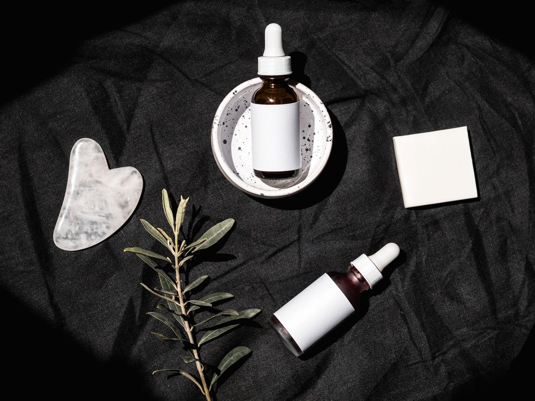
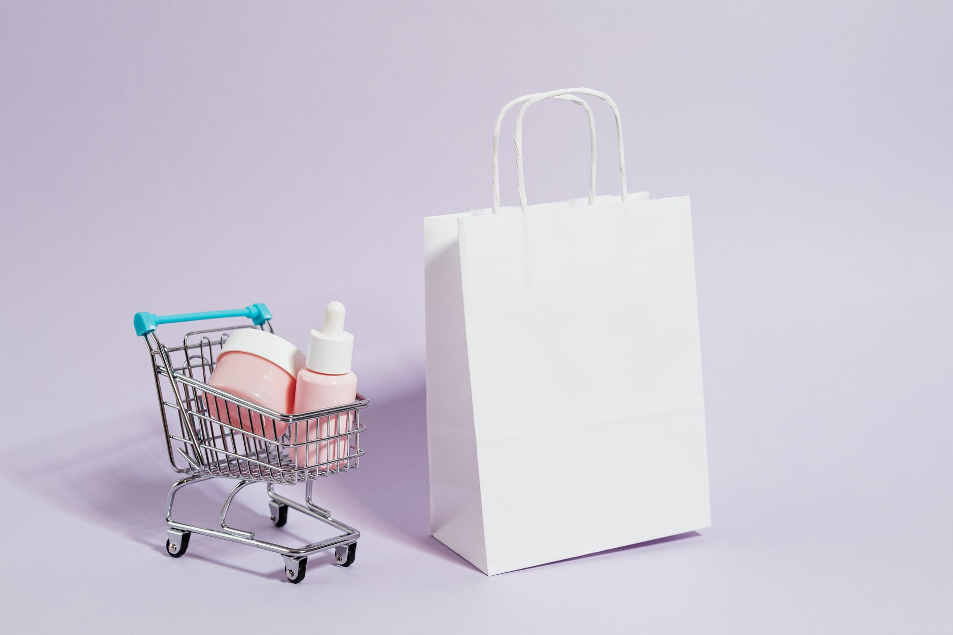
Ingredient-coded packagingBottle & dropperWeb & PDPSampling cardsUnboxing system
The outcome
Orchard’s ingredient-coded packaging made the range instantly shoppable. The line expanded from 4 to 11 SKUs on the same system without a single new layout.
4→11
SKUs on one system
+31%
PDP conversion
0
New layouts needed
“We went from four products to eleven on the same system without a single new layout. That’s how you know the bones are right.”— Mara Okafor, Founder · Orchard Skincare